Tuesday 2 April 2013

D&AD - Batiste Brief


Creative Challenge

--------------------------------------------------------------------------------------------------------
Make Batiste a must-have product for every beauty toolkit, appealing to new customers and engaging with existing ones. Build the Batiste brand by creating four new graphic identities and fragrances.
They should fit in with the current range but have stand out shelf appeal. Demonstrate this across a number of practical applications, including packaging, website and point of sale.
Batiste are fashion-led, utilising trends to ensure that they have significant shelf appeal and strong brand loyalty. How can the graphic identity work harder to sell the varieties of Batiste in an instant, whilst also clearly demonstrating the full potential of the product?
--------------------------------------------------------------------------------------------------------


My Approach :


"appealing to new customers and engaging with existing ones"

Well what about branching out to the male market? Men do use Batiste (maybe not as often as women do) but I know they do use the stuff. So, would it be a missed opportunity if Batiste don't create a male identity within their company (make it okay for men to buy the products in the shops and have it part of their grooming kit). Personally I think so. Unfortunately I didn't have my designs finalised enough to enter the competition due to my dissertation deadline. It's been a busy 3rd year. Also I haven't yet created a P.O.S.D.U as required in the D&AD brief. Luckily is this part of my graded module at uni, So the brief/work was compulsory. Obviously I've aimed and designed my bottles at the male market :)
I think my designs are fairly self explanatory. I've gone for digital camouflage approach as it's very masculine and popular and I've also used the tinted sprays (like the women one's have) as they are (in my opinion) the most effective types of batiste products! 
I've gone opposite to the female designs and put the patterned print on the can lids and have the can left aluminium (plain). Last but not least I choose not to 'create a smell' as I'm not a scientist (I some time wish I were) and wouldn't know what a good shampoo-y smell for men would be like....

Anyway enough ranting. Enjoy

The Whole Collection:


Website :


(the empty box is for when I get round to creating my P.O.S.D)


Point of sales. (P.O.S.D) :


Friday 15 March 2013

YCN - UGG for men brief


The Creative Challenge:

-----------------------------------------------------------------------------------------------------------------------------

The challenge is to develop creative ideas that will increase awareness among men of our product range. We need to give men permission to buy into UGG and to wear our products. How do we grab the attention of guys, and leave them in no doubt that UGG is a relevant and desirable brand for them?

-----------------------------------------------------------------------------------------------------------------------------

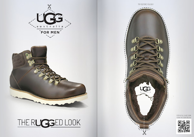
My campaign for male UGGs is based on awareness and interaction. From my market research, I found that generally males are not aware of the new UGG range, they associate the brand with the classic female boot. To help change this perception I've designed a campaign with a consistent identity which highlights the greater range of products available to men. This includes a double page spread showing off the new style of boots and shoes. Keeping the design elegant and simple, it conveys the UGG brand, with emphasis on the range with the use of large product photography. Also incorporating a 'try before you buy' idea as a quirky way for the public to interact with the advert. This helps create a unique identity for the product, that is different and might entice (even if its just for fun) men cutting out the shoe, and could provoke a social media reaction. 

The second magazine pitch is the 'our little secret' advert, which continues the campaign. Indicating with the absence of the UGG logo that someone has cut out the logo and applied it to their own shoes, as they want the UGG look. Alternatively, could be seen as they love the shoe but want to remain in the dark on the brand light heartedly playing on the old UGG perception (this would depend on the reader).

I've designed 3 different posters all in keeping to the previous identity, however I've played with the word Ugg in relation to the product's unique selling point. Lastly I've mocked up a website look that continues the aesthetic where people can download a wrap-around shoe, which they can cover their footwear with, to continue with the 'try before you buy' concept and also the concept of pretending your shoes are UGGs. 

I've included two extra promotional ideas. First one is a cubicle idea, using Guerrilla Advertising. Where a panel covers the bottom of the door giving the appearance that all the males using the cubicles are wearing UGG boots and shoes. The second is more of a point of sale display unit. I envision this to be in shops where UGGS are sold. This concept is asking you to stand in front of the mirror, line yourself up and look what you could look like if you were wearing UGG branded shoes.

Magazine spreads 


POSTERS


WEBSITE


PROMOTIONAL IDEAS 


Monday 28 January 2013

ICE TYPOGRAPHY!

Another University Project (year 3!)  

This project shed AT LEAST 6 years off my life expectancy due to the amount of stressed it caused me! 

This module was called 'Experimental Typography 3', and the deal was you could pick any famous quote you wanted and take it out of its context. Let me elaborate (the complicated part) Taking it out of its context and giving the quote a whole new meaning! So I decided to go with the famous Spock quote "Live long and prosper" as everyone knows this is meant (in its context) as a greeting wishing people a rich and happy life.. 
I decided to take things to a new level and making it about exceeding in your career (prospering) enough that you will (live long) in memory E.G Vincent Van Gogh he died at the age of 37 YET 123 years later we still study and talk about him and his work… 

Do you see where I'm going with this? He's 'lived long in memory' longer then he actually lived for!

ANYWAY MY CONCEPT (as that was my rational…


I thought it would be interesting to use a media that didn't last long at all (contradicting what it's saying) but is capable of leaving a mark on something indefinitely. 
Out of coincidence I got a set of typographic/alphabet ice cube set for christmas! 
That's where the experimenting began. I shan't go in to grave detail of my step by step of what I did.. but it ended up me adding Windsor inks and all sorts of colour dyes to water and freezing them in my letter moulds. Once they were frozen I started looking at how each media melted and what effect it had on different types of papers!


Before I knew it my whole idea had evolved, I ended up buying £47 pounds worth of custom made silicone moulds (on a larger scale to my ice cube set) Learn't the art of engraving with wax onto cotton fabrics, I also learnt how to effectively customise ikea shelving units to suit my artistic needs!  

BASICALLY 

I designed the dyed ice letters to hang from a shelving unit and drip on to a cotton canvas and staining it apart from the waxed out words…. 

Argghhh the Images will talk for themselves better then I can! 


Add caption

Overall, it was a great experience, I've learn't a lot from it and I know it's not something I would be able to do in industry (that's for certain, its very faffy and time consuming

That in mind I made sure that it was important for it to look and become more of an exhibition piece, a piece of art. 

p.s :) : 
BELIEVE ME, IT HAS LIVED UP TO IT'S NEW MEANING AND LEFT A MARK… 
The splash back from the inky water has PERMANENTLY stained our studio flooring/wall! 

:P 

whooopppssss! 

Tuesday 14 August 2012

Photography, Insecurities of the body

This was for my extra module at uni that we had to take, I took photography and decided that I was going to base my project around insecurities about our body. So I gathered some brave friends of mine to confess to me what that hated about themselves. To be different I decided that it would be cool to use an overhead projector and project their words over their body and photograph them that way
…. If that makes sense…. 

Anyway enjoy!


Friday 13 July 2012

Oggy oggy oggy, Oil Oil Oil!

This was a social issue project I did at uni. (2nd year)
 I decided to be different and avoid the obvious bullying and eating campaigns and try educate people about some underlying problems you don't see or hear about very often.
I created 3 different posters an interactive one an animated one and the standard static poster.
However I can't upload the interactive poster of animated poster atm as they are .swf files and I'm not sure how how to add them on here just yet so I've added in some screenshots.

Static Poster


Animated (screenshot) 


The timer in the middle (41:09:00 etc) counts down quietly in the middle of the poster, I did this because I think it's quite a powerful effect. The timer is something you can't stop or reset, it's based on real statistics (http://www.worldometers.info). Personally I think the  animated poster sitting quietly in the background ticking away in shopping centres and train stations mimics how little people pay attention to the issue or even know about it!


Interactive Poster (screenshots)


I felt quite panicked myself, I remember laying in bed at night while I was doing this project and thinking to myself I will be in my 60's when this is meant to happen (if consumed at current rates) and my possible children in the future will be dealing with this issue at its prime. It wasn't great took me ages to knock off at night. 
I needed to find something positive to come out of the unchangeable issue (as the aim wasn't to cause mass panic) This was hard to  to get my head around, specially after doing ridiculous amounts of research on the subject, I watched lectures, films, documentaries, read articles after articles so I knew what I was really happening behind the scenes. I stumbled across a japanese invention which can turn used and recycled plastics back into its original oil form. 
(if you wish to know more - http://www.designboom.com/technology/plastic-to-oil-conversion-machine/ - be my guest)

So I based my Interactive poster about this machine and show people that there's a possibility for change.


hope you like :) 


Thursday 12 July 2012

Ahoy!

This was for a local drama group called Encore. I got to design their programme, poster and tickets for their show called 'The legend of the tigers eye' Twas good fun to do! :):)


Lets-a-go!

This is some OLD School Design I created for my final major project back when I was in college.

I decided to create my own brand called G.E.E.K (this was before geek sheek was so popular)

I created my own little shop window for my exhibition.


Heres a Few pictures of my exhibition of G.E.E.K


However since college I've made little 3D mock up of what the packaging looked like in Modo